“White space is not a void, but a structural element—it defines rhythm, hierarchy, and calm.”
Guiding principle
Brand foundations — 001
Assets & replication
Below is the editable Affinity source for the wordmark, plus plain-language settings that correspond to the website’s CSS (including what Tailwind utility classes mean in real typography terms). Use the same variable font files as Google Fonts where possible.
Affinity source
Native .af — open in Affinity Designer or Publisher.
This is the small lock-up in the top bar of the public site — not the oversized specimen further down this page.
Main line uses regular Newsreader; the words “Shopify” and “SparkLayer” are set in italic inside the same block.
Hero supporting line
Hero link (“Discuss your project”)
Small caps lines such as “Selected Archive”, “Expertise”, or colour names on this page.
The display wordmark below is for brand presentation, not the live header.
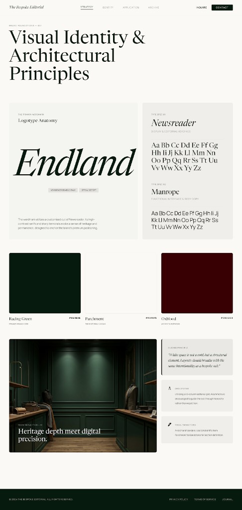
The primary wordmark
Endland
The primary wordmark uses a customised cut of Newsreader: high-contrast serifs, sharp terminals, and a heritage publishing feel. Allow generous clear space; avoid shadows, gradients, or distortions. Preferred colour: Racing Green.
Type spec 01: Newsreader
ABCDEFGHIJKLMNOPQRSTUVWXYZ abcdefghijklmnopqrstuvwxyz
Type spec 02: Manrope
ABCDEFGHIJKLMNOPQRSTUVWXYZ abcdefghijklmnopqrstuvwxyz
Colour system
Racing Green
Primary brand core
Parchment
The editorial canvas
Oxblood
Accent & emphasis
Mood reflection — 01
Heritage depth meets digital precision.
“White space is not a void, but a structural element—it defines rhythm, hierarchy, and calm.”
Guiding principle
A 12-column editorial grid with controlled asymmetry. Eye guidance through hierarchy, not repetition—layouts feel composed rather than templated.
Avoid harsh dividers. Use subtle tonal shifts—Parchment toward deeper green—to maintain rhythm down the page without decorative noise.